


Travelogue is a website and app for planning and documenting travel in a meaningful way. It’s a digital travel planner and journal in one place. Users will use the app to plan their trip, having all their information together to easily access and share with other travelers or family. Then, as they travel, they’ll be able to upload pictures and write memories in the app. At the end of the trip, they can turn it into a PDF or have a book printed of their special memories.

DESIGN PROBLEM
With smartphones in our pockets, travelers in the 21st century can easily snap photos of whatever they want when they travel. But with all the access to tools, this abundance of choice can often be overwhelming and meaningful photos and memories can often stay on our photo apps, to be forgotten. Travelogue is an easy-to-use app to help travelers make and record memories of their travels and provides easily exportable PDFs to share with friends and family. The goal of the design is to capture the collage like aesthetic of travel journals and scrapbooks while maintaining simplicity and ease of use for the user.

DESIGN PROCESS: MOODBOARDS & SKETCHING
I started my research by gathering images of handwritten travel journals. I looked at the style and noted the different aesthetic choices. Then I did research on travel in general. I noticed that there’s a gap in the market for the creative tech-savvy traveler. I also noticed that a lot of travel photos and sites that I liked were simple, left room for a lot of negative space, but used beautiful photography and let the images speak loudest.
DESIGN SOLUTION AND FINAL OUTCOME
Since travel journals are often collaged and a bit chaotic (that’s their charm) I decided to use a simple, clean design to let the images the user could make, take center stage.
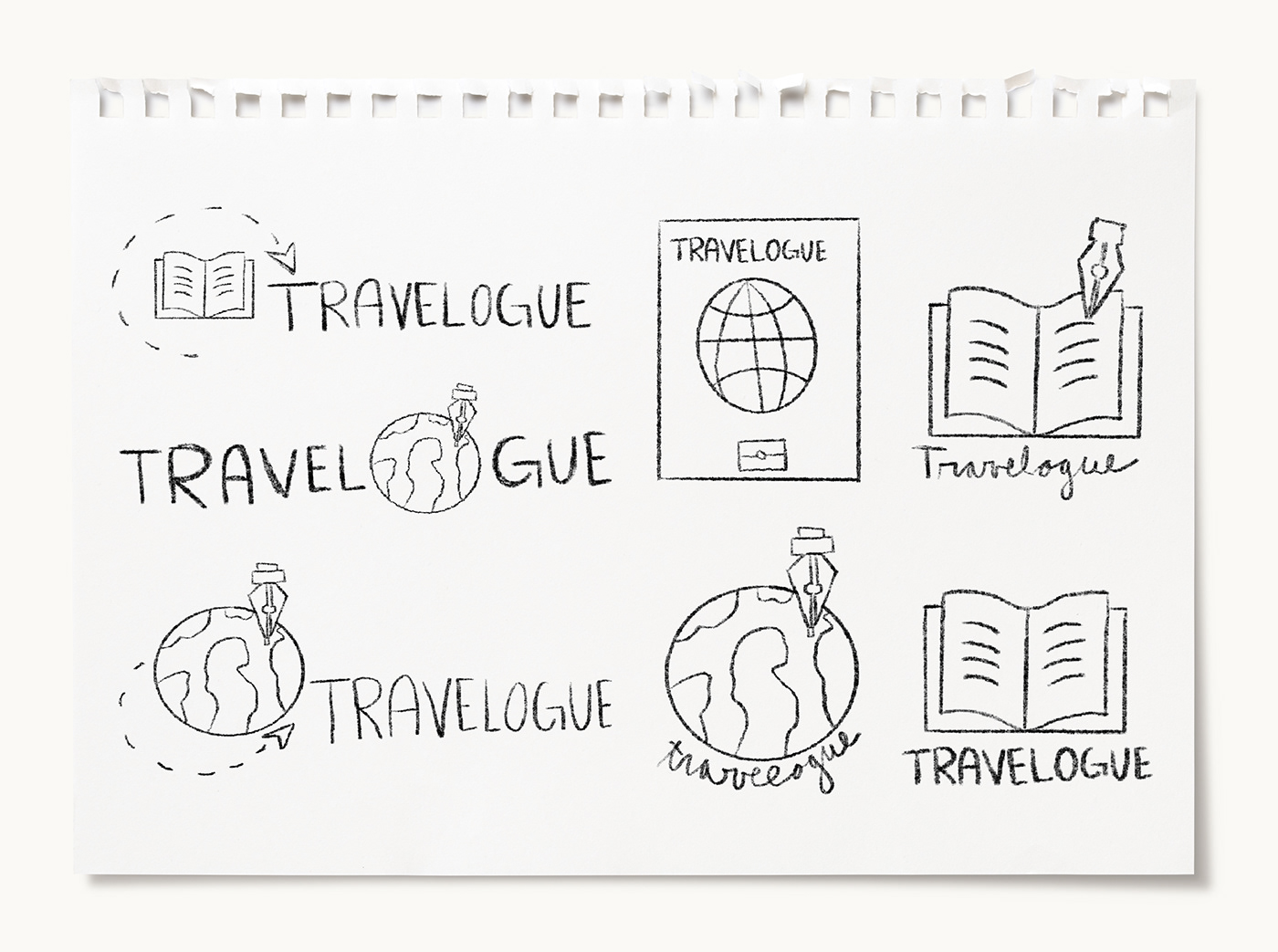
For the logo, I wanted a modern version of a stamp or drawing that would be in a handwritten travel journal. I decided to use a minimal, blue and green color palette, to capture the colors and mood of the earth. I chose the two colors and the book/arrow illustration to convey the message of the brand in a simple, clear way. I also gave the letters space to breath and selected a modern serif type that echoes old text and handwriting. I kept with the same color palette and simplicity for the stationary.
For the website and app, I used the same elements, of color, repetition, and use of negative space to define the areas that were most important, the collages.


PRINT DESIGN

WEBSITE DESIGN


APP DESIGN


